Back to Homepage

Try it live

The tool runs below. The most important thing to find is the small OPM / interone toggle in the top-right of the header. It switches the entire interface between two design worlds, and those two worlds tell the story of this project.
interone

The pre-merger version, the concept the intern team and I built together.

OPM

My post-merger proposal: an AI-assisted rebrush into the new Omnicom Precision Marketing identity.

Flip the switch in the embed to compare them side by side.

Open in full screen ↗

The brief

Every intern cohort at interone runs a dedicated project to learn how Digital Strategists and UX/UI Designers actually work. This round, the HR team played the internal client: build an interactive JobMatcher for the website, so prospective interns can discover which role fits them best.
01 · Strategy

A month of research

Led by my colleague Lena, the interns ran user interviews, benchmarking and user-need mappings, turning raw curiosity into concrete User Needs, Pains and Goals.

02 · Design

From insight to interface

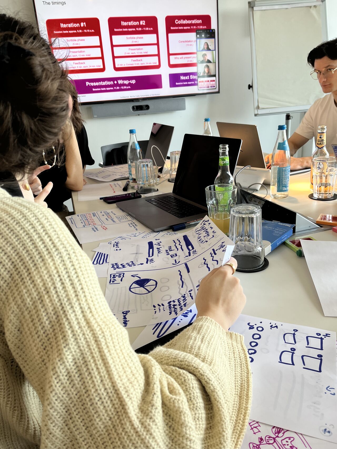
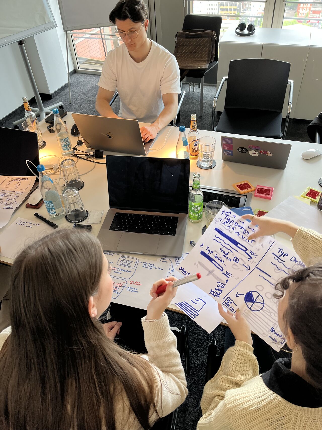
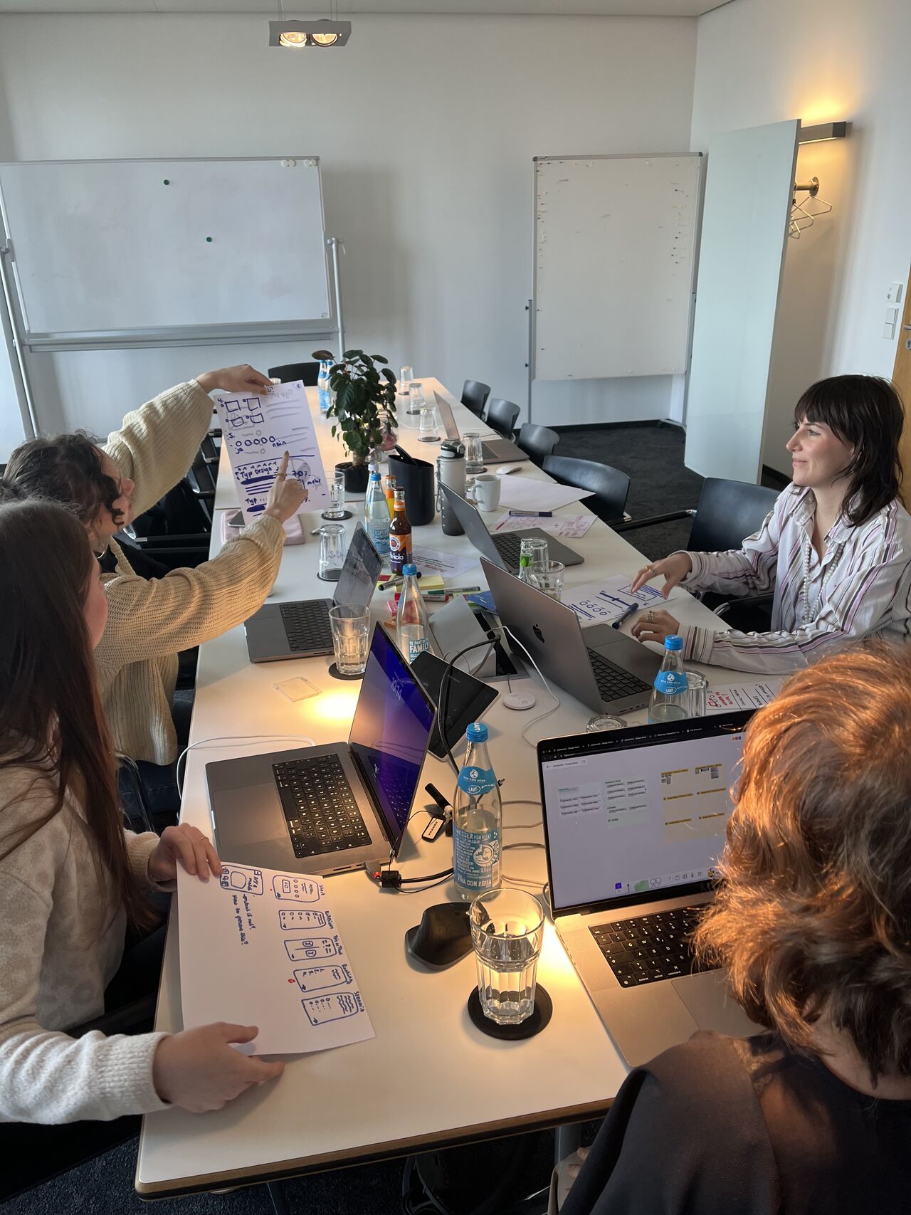
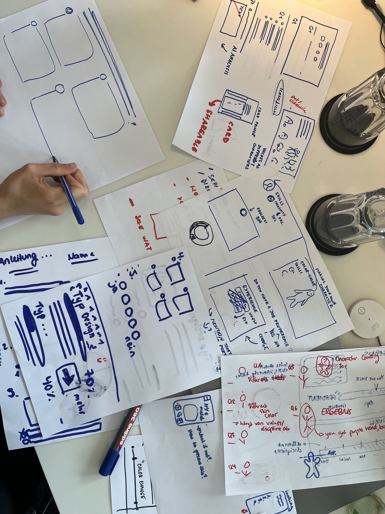
I introduced the second phase and facilitated a Design Studio workshop to translate strategy insights into actual scribbles, then into wireframes and a tested click dummy.

03 · Handover

Build & brand shift

The concept went to development. Then interone merged into Omnicom Precision Marketing, and I proposed an AI-assisted rebrush into the new identity.

Pre-merger · The interns' project

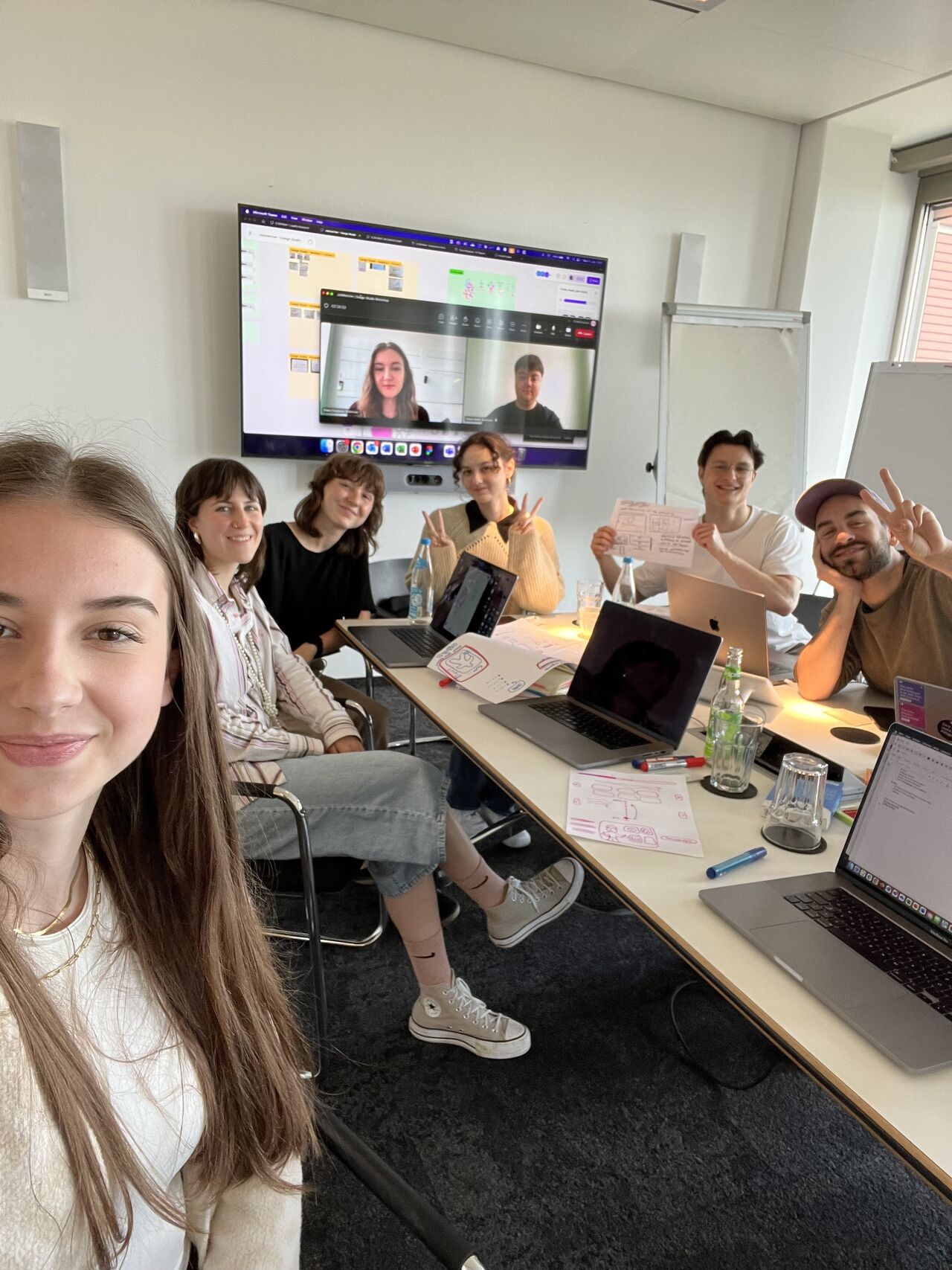
A Design Studio workshop brings a multidisciplinary team together to generate many ideas from different perspectives, early. The six interns worked across locations; I guided them through the process so they learned both the method and the way our Experience Team works.
Post-merger · My AI rebrush

When interone merged into Omnicom Precision Marketing, the JobMatcher needed a new face. I rebuilt the front-end with an AI-assisted workflow, keeping the exact same matching logic and question flow but re-skinning it into the OPM identity: different typography, colour system, motifs and tone. The toggle in the embed lets you switch between both versions in place.
interone

The team's concept

Red-to-purple gradient identity, the original “Work-Type” framing, and the layout the interns and I shaped together in the Design Studio. This is the pre-merger product.

OPM

The AI-proposed rebrush

Omnicom Precision Marketing branding: aperture motif, refined type pairing and a calmer palette. Same logic, same questions, a new identity. My proposal for life after the merger.

Shared on LinkedIn

The interns didn't just learn a method; they shipped a real product, and I got to mentor a team through it and carry the work across a brand change.

Jonas Happ · Junior UX Designer, project lead & mentor

My LinkedIn write-up on the Design Studio method behind the concept.

Don't be shy! Let's connect to make something special